Five Simple Rules For Creating Buildings People Will Love
Why So Many New Buildings Feel Bad, and How to Fix Them

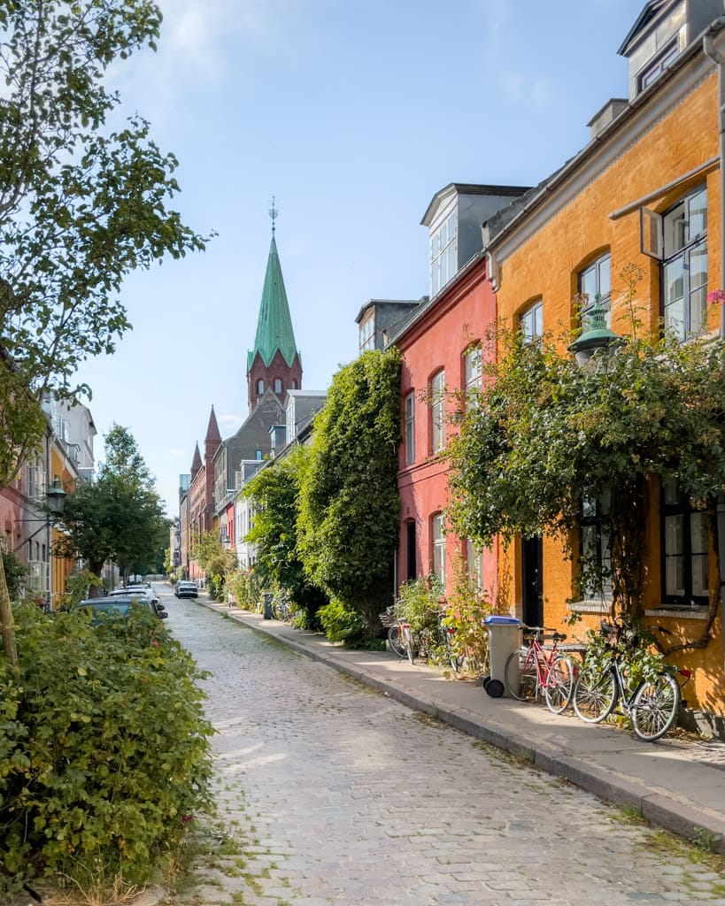
Few newly constructed buildings inspire much affection. If they manage to conjure any feeling in us at all, it’s often an uneasiness at the dull monotony of their “design”, a sudden urge to exercise (to walk or run by them as quickly as possible), or perhaps contempt at the perceived indolence of the people who created it. Surveying the landscape of contemporary development, one would be forgiven for believing we can no longer build well. Thankfully, this is not the case. There are many thousands of excellent new developments that have been created in just the last few years, all across the continent.
That these many efforts do not share a specific style matters little. Beautiful buildings exist at every point along the design spectrum. Happily for us, creating good architecture is a rather simple exercise. Good design is little more than adhering to a few rules, following a series of basic relationships, and copying what has worked over time. It’s agnostic about what chosen flourishes are layered on top. As the Dutch architect Mieke Bosse has elegantly articulated: “Tradition is the sum of successful innovations”. In order to become good city builders, we need not reinvent the wheel. We can simply take what has worked in the past, and add on to it that which suits our modern needs and sensibilities.
It’s in this spirit that I will lay out a set of guidelines for designing new buildings which are capable of capturing our affections, and equally as importantly, are financially viable to construct. Specifically, I’ll focus on “Missing Middle” housing forms as I believe they’re the most important building blocks for constructing better cities. Coined by Daniel Parolek in 2010, Missing Middle refers to typologies that were prohibited by the rise of modern zoning codes (hence, missing), like attached townhomes, quadplexes, and smaller apartment buildings, sitting in between legally permissible single family homes and large many-hundred unit complexes (middle). After nearly a century of our development patterns being dominated by single family homes–and hulking apartment buildings in the last two decades–it is high time for a return to more human scaled cityscapes.
As Missing Middle matures as a form, we have the opportunity to chart a course for what it might grow into. Thankfully, many of the elements of good design have very little to do with monetary cost, though a greater investment of consideration (and often, time) is merited. Though there are many components which make a building good (and some that are outside of the control of any good architect, such as urban design and land use regulations), five stand above all others as worthy of special attention.
If you’re reading this, you care deeply about why the world looks the way it does, and how to make it better. So do I!
If you enjoy thinking critically about how we design, build, finance, and steward the places we live, and how we can practically create the built environment we all dream about, I’d be enormously grateful for your support of the ideas, projects, and essays we share here.
Thank you so much for reading. Now, for some rules to create places people will love!
Setbacks are perhaps the simplest guideline of the 5 on this list, both in theory and in execution. They are exactly what they sound like they are: setbacks from the property line. But they play the critical role in defining space. A building constructed right up to the property line has an inordinately higher connection to the street than another further away. The zero-setback property is more welcoming of passersby, inviting them to more tangible interaction, as opposed to the anti-social defensiveness of a building that is some 10, 20 or 50 feet in recession.
It is no surprise that many properties with deep front-setbacks often have gates, solidifying the impression they want to protect against would-be dangers from the street, rather than engage with it.
What goes in the setback? Well, very often, not much. And so these spaces become dead, and occasionally unsafe. That’s because while they are defensive, they are not defensible, as in the case of the Coney Island Houses (below). Where does one go in the voids of disuse? What does one do? These are modern day moats.
Where the space is more defensible, but have parking lots, the lack of safety continues. Each curb cut represents an opportunity for passersby to be clipped by an unwitting reverser. And runways of asphalt make the walk feel harsher than if front gardens lined the street.
Contrast this with the liveliness privileged by a structure nestled right up on the property line, which, when combined with narrow street widths (known as the right of way or interface), lends tremendous comfort. To walk on a narrow Missing Middle lane with no setbacks (as in Philadelphia’s Washington Square West, or Vieux Quebec) is to be gently hugged. Not overbearing, but just right. Instead of feeling vulnerable, we are protected. Rather than feeling lost in an expansive public realm, we find deep comfort in the intimacy of more compact settings. Where allowed, this is a design choice that costs no money at all, yet returns considerable value.
Massing refers to how a building’s form is composed. Does it rise straight up? Is it articulated with parts that jut in and out? How bulky is it? Scale deals with how big a structure is, and its relation to its surroundings. Not only its height, but also how wide it spans down a block, and how deep it extends into the lot. Successful Missing Middle typologies are built at the “Human-scale”, where structures have a harmonious relationship with people on the street. Not too tall, not too wide, not too overbearing. These examples are very often fine-grained, meaning they are but one of many relatively narrow structures on a block.
This leads to what urban designers call a “fabric” of buildings knit together. Just as with a beloved blanket, there may be pops of color or individual elements that jump out at us, but they remain coherent, and subservient, to the whole. When one building stretches all the way down a street (or even worse, extends to the property lines of the four streets that bind a block in what is known as block-through development), there is no fabric to speak of, as there is only one thread. This homogenous block through development—no matter how beautiful the architectural style—is anathema to the stimulation our brains demand. That’s why walking downtown Austin (below, left) feels boring, while Amsterdam’s Nine Streets (below, right) is attractive and dynamic.
While the architecture is good in the picture of Amsterdam, and bad in that of Austin, it’s completely secondary to our perception of place; the buildings in Amsterdam frame a comfortable streetscape, while those in downtown Austin actively shun passerby. Even if there were something to do besides park one’s car, why would you? The building dominates the street, totally overwhelming the public realm. Far better to have several narrower structures (they can still rise quite tall, as is the case in New York’s Midtown South) than one large monolith.
In fairness to some developers, control of scale can be taken out of their hands if their city privileges more blocky development patterns. But there’s no reason why massing, even in a city with poorly written land use regulations, cannot be elegant and deferential to the street. As a rule, most lots in our ideal city should span 15 to 50 feet wide, with only the most significant and architecturally dignified stretching beyond 75 feet. This guideline, again, costs no additional money, and in fact may save funding by eschewing needless bulk and articulations.
Facade and structural materials may seem only superficially important—the icing on an already delicious cake. But they are far more than just icing. External materials are how we principally relate to a structure. Two identical buildings in all other respects would conjure wildly different emotions depending on the chosen cladding. It matters little if the envelope, fenestration, and setbacks are identical, a glass-clad quadplex is of a fundamentally different nature than a stone one. We are of the earth, and so we tend to gravitate towards natural materials like wood, brick, stone, and lime plaster (stucco), as opposed to concrete, glass, or vinyl. The more natural, the better.
Beyond Biophilia—along with technological limitations, proximity, and the capacity of labor—there is a very good reason why specific materials have been used in specific environments over the course of history: thermoception. As humans, we perceive temperature as it relates to different contexts. White stucco reflects heat in sun-scorched locales far better than dark metals, which would make us unbearably hot. Using concrete (a cold and austere material) doesn’t make much sense in Canada, which has many cold and rainy/snowy climates. Though we may feel cold regardless, hurrying by a hulking Brutalist structure in 0 degrees is qualitatively different than passing by a row of brick townhomes. This isn’t to say that synthetic materials should never be used. Hardly. I am a great admirer of many glass and concrete structures. But the context cannot be ignored. While glass is more capably handled, it’s probably best to reserve concrete for warmer climates like Mexico, or Bangladesh, where its cooler effects can be enjoyed with greater complementariness.
Good gentle density is aware of its context, and employs the most felicitous materials for it. While this is the most expensive guideline in the essay, it is not profligate. Facades may comprise 10-20% of the hard costs of a building, depending on the scope of a project. While stone may well be far more pricey than vinyl, quality stucco is competitive, to perhaps 20% more expensive at the higher end. On a financial basis, this hardly impacts the bottom line by more than a few dozen basis points (nominal), but more than makes up for this in how passersby and tenants sense buildings. Fiber cement board, though not natural, may also be turned to as an economical alternative as it far more capably mimics wood than vinyl, with its thicker reveals, durable construction, and pleasing finish.
One of the more under appreciated elements of good building design is the composition of windows. Symmetrical arrangements are important, but of even greater significance is the relationship between window and wall assemblies. I suspect one of the key reasons why so many people feel that new development is cheap, but can’t exactly articulate why it feels that way, is because of the subtle change in the depth of windows. We are used to seeing historic buildings (and well-executed contemporary ones) have windows with some level of intrusion, and so are primed to look for it. Only a few inches of recession is enough to give a pleasant impression. But in cheaper constructions, the windows are flush with the facade. Instead of gradual breaks in a rising structure’s height, elevations become more imposing. What’s more, new windows are made out of synthetic materials, like vinyl and aluminum. Very rarely are they divided with many panes (divided lite windows), which, as Christopher Alexander memorably describes in rule 239 of a Pattern Language, is important for giving us different perspectives out into the world. Each window may now offer a dozen vignettes of life thanks to the separation of panes via muntins, as opposed to one.
As with materials, there are practical benefits that extend beyond aesthetics. Recessing windows improves thermal performance as the additional space around the window acts as a barrier from the elements. This reduces heat transfer, and improves energy efficiency. This separation also reduces glare, where sunlight is diffused in the border area.
Last, but not least, a building must be completed. How foolish would it be to do all of the work that got us here, and forget the finishing touch! Simply put, a building must have a crown to be complete. This may take the form of a cornice, a gable and eave, crenellation, or even articulated brickwork rising from the parapet. We expect a neat conclusion to any story, and buildings are no different. In the image below of a row of Brownstones in Brooklyn, one structure is conspicuously missing its crown, and as a result, feels incomplete. Though the facade is not as richly detailed as its neighbors, the building is functionally identical. How great a difference a simple mansard and cornice can make!
As with most of these rules, aesthetics are informed by the practical. Cornices provide important protection from weathering and water damage. The stains that spoil our crownless building above are non-existent in the adjoining structures. What small funding is saved at the onset eventually proves foolish, as over time, water damage may critically imperil a building, costing far more than a dignified cap.
How do we design better infill housing and gentle density? As I have attempted to prove in this piece, we can get most of the way there (perhaps 75%) before even thinking of a favored architectural motif. With limited setbacks, fine grained and human-scaled massing, natural and/or contextual materials, symmetrical windows recessed a few inches into a facade, and a proper crown completing the composition, any city can set a template for infill housing with high base standards. Where they wish to go from here, I plead ignorance, as good planners are agnostic to a given architectural style. Inflexible prescriptiveness–no matter how lovely the prescriptions–is guaranteed to lead to poor outcomes. Moreover, what makes sense in Halifax may not work for Calgary.
This is not to be confused, let me be clear, with a belief that architecture doesn’t matter, or that a city shouldn’t define its own identity via design. As I have long argued, these considerations are immensely important. But the brush of this or that school must be applied after the preliminary sketch and primer coat. Never before. It is only after weaving all of these rules together, and following them dutifully, that the brilliance of a coherent architecture can shine through. Should we wish to go further, we can have our cake, let me assure you friends, and eat it too.
Creating good infill housing is a challenge that goes well beyond aesthetics. Where we live impacts us profoundly physiologically and psychologically; it impacts our social lives, our economic fates, and how we perceive ourselves. But the foundations of good urban form are fixed. We are all of us humans, the same at base. What different colors our skins take on, length our hair extends, or fashion of clothing we choose to adorn ourselves with does not change the fundamental perfection of humanity. As with people, so too with the Missing Middle!
I hope you enjoyed this piece! If you did, please consider subscribing, or sending it over to a friend. It would mean a great deal to me! And join in on the conversation below with your favorite recent projects!


The Missing Middle framing is spot on. What's fascinating is how zoning codes didn't just accidentally create a gap - they actively erased an entire category of housing that had evolved over centuries because it worked. I've walked through neighborhoods built pre-1940s where quadplexes and townhomes are indistinguisable from single-family homes in terms of streetscape, but modern codes treat them like industrial uses. The zero-setback point about creating intimacy rather than exposure is something I wish more developers understood instictively.